
Published 26th June, 2019
The whole debate kicked off when Arvind Subramanian, the former Chief economic advisor wrote in an Indian Express article that we’ve probably been overestimating our country’s economic growth. It wouldn’t have raised eyebrows if it weren't for two minor details. The article came against the backdrop of genuine concerns about an economic slowdown. Two, it came from a former insider, somebody who ought to be privy about the inner workings of the economy. Long story short, this kicked off a massive debate online soon after and everybody had an opinion on the matter.
However, I was particularly bothered by the fact that, of all the people criticizing Arvind Subramanian, very few people had, in fact, read the highly technical paper which formed the basis for the Indian Express article that sparked the whole debate. So this is my humble attempt to make the complicated paper accessible to a much larger audience; so you too can join the illustrious list of armchair economists patrolling on the frontlines of Twitter.
Arvind Subramanian (AS) begins the paper with a quote — “As we measure, so we are” and argues the need for accurate measurements — in particular, of GDP. The suggestion is that multiple stakeholders in this country and outside it, base their decision off of the country’s reported economic growth. Governments decide their spending list, RBI sets its interest rates and the odd foreign investor might choose to set up his new manufacturing plant in India based off of this little nugget. So there is a lot at stake when the good people at the Central Statistics Office put this number out every quarter. The bottom line — If our measurements fail, our decision making will falter soon after.
He then quotes a few others who have raised some valid concerns about our GDP estimates and soon enough gets to the meat of the paper— The change in methodology. In 2014-2015, there were two major changes applied to how we estimate GDP. The first change pertains to a radical departure from the old school way of doing things. The earlier estimates predominantly relied on volume indicators i.e. the quantity of goods and services produced to estimate GDP. The new more modern version uses (more often than not) value indicators, or more precisely “gross value added”. Ideally, if you could use both price and quantity whilst estimating GDP it ought to make the estimates more robust as against using only quantity (volume indicators). Unfortunately, as we will find out later, nothing is ideal in this godforsaken world.
The second change pertains to the change in the base year to 2011–2012. When economists measure GDP they often come up with two numbers. A nominal GDP where value is measured based on today’s prices and a real GDP where value is measured based on prices during what is called a base year. In a country like India, where prices can rise disproportionately every year, there is significant merit in measuring economic activity simply by looking at the total change in value of goods and services by keeping prices constant. Are we producing more stuff in 2015 than we used to back in 2011? That is the all-important question economists want an answer to. So the base year effectively decides what prices we use when calculating Real GDP.
The way this works is — once the nominal GDP is estimated, you use what is called a deflator, sort of like a knob that adjusts the nominal value to more accurately reflect “real” activity in the economy. Arvind Subramanian’s argument throughout the paper is that our measurement of real GDP is suspect because our knob is broken i.e. the deflators we use to convert nominal GDP to real GDP is misleading us into thinking we are growing at 7% when we are not. In fact, there is almost no mention of misestimation of nominal GDP in the paper and AS leaves this exercise to future researchers who might want to dig deeper.
Anyway back to the story. After this whole change in methodology was finalised, GDP for all the years post-2011 was adjusted to more accurately reflect economic activity using the new method. So AS picks up GDP numbers from 2001–2011, calculated using the old methodology and GDP numbers from 2011–2016, calculated with the new methodology to see if there’s anything wrong with the new method.
The analysis begins with intuition and common sense. What if you could observe a few indicators of real economic growth — say commercial vehicle sales, electricity consumption etc. In a simple world, these ought to be good proxies for growth i.e. growth in these indicators ought to exhibit a strong relationship with growth in economic activity. So AS sets out to see how their relationship with GDP growth changes post-2011. He picks 17 indicators and runs his analysis for the two halves. He observes that relationship (correlation) between most indicators and GDP growth reverses post-2011. Indicators that were positively correlated (as you would expect) suddenly become negatively correlated. This, AS argues, is most unusual. Unless there is a structural change in the economy post-2011, you shouldn't see this happening. And because he cannot attribute this to any structural change, he attributes this anomaly to the change in methodology.
Then he goes a step further. He measures the average annual growth of these indicators during the two halves. Example — production of commercial vehicles grew at around 19 % before 2011 and minus 0.1 % after 2011. This isn’t just restricted to commercial vehicles. Most indicators in the sample analysis behave the same way i.e. Robust growth pre-2011 and tepid growth post-2011. Yet, counterintuitively, average GDP growth doesn't change much during the two halves.
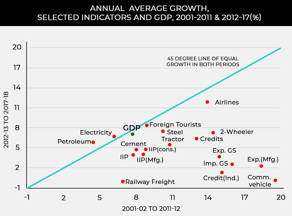
The subtle suggestion here is this — If most indicators that you would normally associate with a booming economy is hardly trudging along, how can GDP growth still remain spectacular. AS then goes on to argue that this isn’t possible and we ought to be overestimating GDP.
To quantify the magnitude of the error in the official estimates AS sets out on another daring adventure — a cross country analysis. He begins with a search for a few indicators that could be independently measured and as such not susceptible to fudging. He picks Credit, Exports, Imports, and Electricity consumption as his choice indicators. He then relates these indicators to GDP growth (using an equation) for a number of countries. Now the question he sets out to answer is this — how does India behave during the two halves in comparison to the rest of the world. Let me explain this with a few handy graphs.
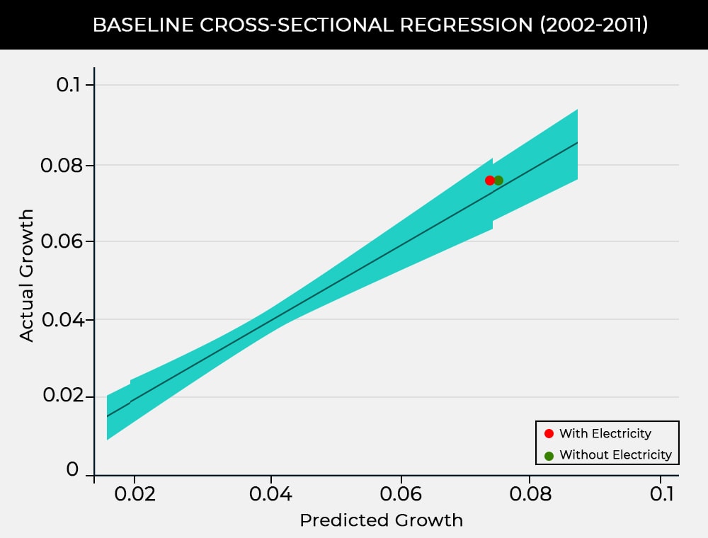
On the horizontal axis are the predicted values of growth for each country obtained from the equation AS created, and on the vertical axis are the actual growth rates. According to the equations, the black line is the line where you would expect India to be if our GDP measurements were accurate. The blue area corresponds to an acceptable range of sorts. In the figure posted above i.e. pre-2011, India is close to the black line (or the sample pool) indicating that India is not an outlier.
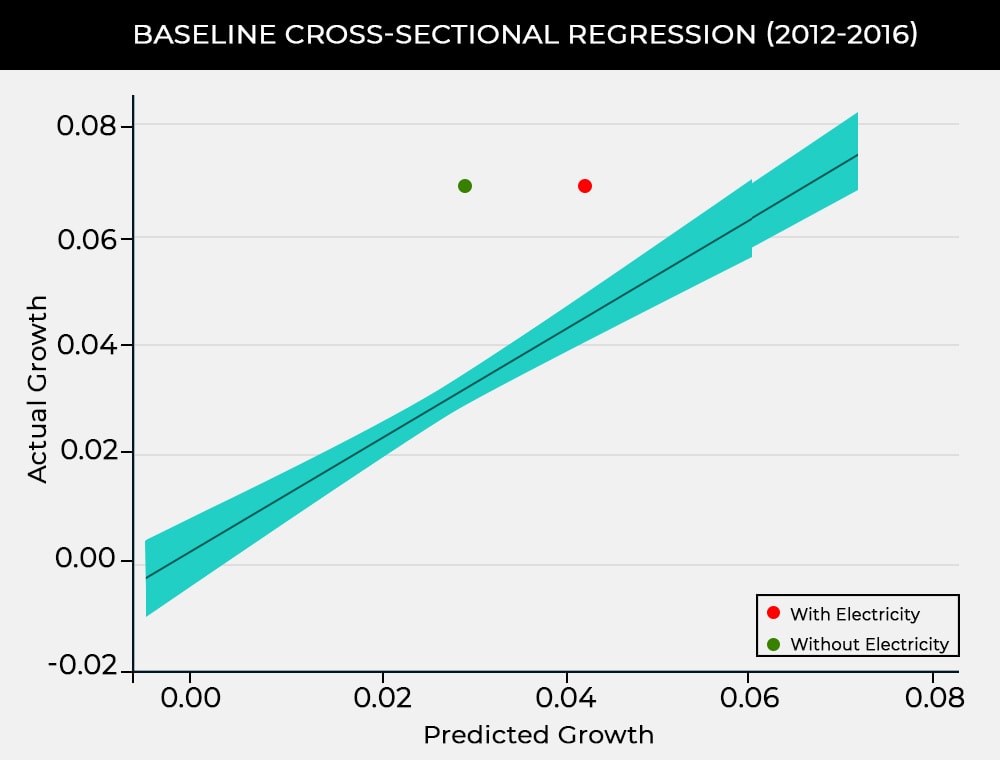
However, for the period 2012–2016, India becomes a very big outlier. AS also notes that there are other countries, like India that are major outliers but does not dwell on them much. Conclusion — Something happened post-2011. Must be the damned new method.
The next section is dedicated to measuring if his analysis is any good. He checks to see if he can fool his model (equation) into throwing up wonky results if he changes the time period. So he runs his analysis for two different time periods. From 2001–2006 and 2006–2011 and checks the results once again. And…….. It’s good. During both halves, India refuses to be an outlier.
He then goes back to see if there are other outliers like India. While AS does, in fact, suggest that there are many such outliers, he cherrypicks China and Ireland, because they have always had ready-made explanations. China has been known to exaggerate its GDP since time immemorial and Ireland has had its own set of problems. Most companies set up in Ireland do not produce within the country. They’re only there to save on taxes. So there is enough room for misestimation. He makes quick work of these outliers and goes on to discuss the most important and controversial part of his paper — the actual magnitude of misestimation.
Using this model once again, AS argues that the overestimation is probably in at about 2.5 %. To add more sauce to the mix he uses another data point — Imports. Growth in Indian imports decreased drastically for the period 2012–2016. He argues that in the long run, you ought to see a commensurate decrease in GDP as import rates decline. However, this does not happen in India. Despite the drastic fall in the growth of imports, real GDP hardly changes during the two periods. The fall in imports would be in line with what you would expect if India’s GDP was toned down by about 2.5% — the total overestimated amount as determined by AS. Voila, the final nail in the coffin. A pat on the back and AS moves on to explain the probable cause behind this misestimation.
AS believes that most of the blame squarely lies in the new method of estimation, particularly the GDP deflator. In the earlier volume based method, prices did not matter as much and so, GDP deflator was of little significance. In the new method, it assumes an important place in the overall estimation. AS uses a small example to show how this works. You can click here to read more.
Economists want to calculate the gross value added in the economy. Under the old method price changes mattered less because real growth numbers were largely based on volumes, not values. Under the new system, however, values have to be deflated by prices to get real magnitudes. Ideally, if output values are deflated by output prices and input values by input prices (what is called “double deflation”), real value added can be properly estimated. But the methodology did not also involve a move to such double deflation; the methodology involved deflating both output and input values by output prices. This immediately induces a bias as the example below shows
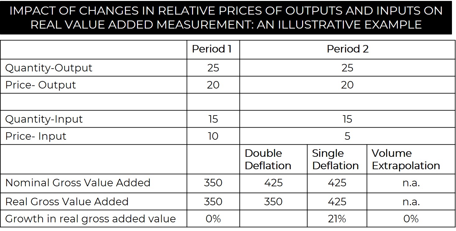
Consider you have to estimate nominal and real gross value added for two periods, 1&2. For period 1, you use output quantity, multiply it with the output price and you get 500. Then you do the same with input quantity and the input price, you get 150. Subtract the two values 500 and 150, you get 350. This is the nominal value. To calculate the real value you have to use prices from the base year as we have earlier discussed. But, because this is the first period we will consider this as the base year and we see no change in real value added. For the second period, we estimate the nominal value i.e. 25*20–15*5=425. Now, to accurately represent things, we calculate the real value added based on two methods. Double Deflation, which is the accurate way of doing things and Single deflation, which is the convenient way of doing things. With double deflation, you take input and output prices from the base year i.e. 25*20–15*10=350. So there is no change in real value between the two periods, as it should be. But with single deflation, you use output price from the base year and because you don’t see a change in the output price during the two periods, the input price isn’t deflated. So, you get 25*20–15*5=425. A 21% overestimation.
The second probable reason he contests — is how we measure the service sector (producer) which contributes about 20% to the economy. Again he shows that our deflators are quite inadequate in capturing real activity here. Finally, he also shows that there is a major problem with how we measure activity in the informal sector — The pakoda-wallas and the chai-wallas that contribute about 5% to the economy every year. We use the formal sector as a proxy to estimate value addition in the informal sector. This, he argues, is deeply counterintuitive especially during times of structural reforms i.e. demonetisation, GST etc, which affects the informal sector much more than it affects the formal sector. So while you could detect growth in the formal sector during these times, it’s foolhardy to assume that the same growth would reflect in the informal sector as well. At least, that's what AS believes.
And so, with a flourish, he finally wraps up his analysis and concludes with another quote — “As we measure, so India will go”. Let me reiterate that my simplified version is a barebone representation of all the intricate, technical arguments AS makes in his paper and should not be used as a yardstick to measure the quality of the actual paper. I am no economist. In fact, I am not even that good at statistics. But I thought it’d be cool if I could make parts of Arvind Subramanian’s paper accessible to the common folk and if I have made some headway in that regard, I am happy.
. . .
Also, this article is a precursor to a 2 part series we will soon be publishing on the Indian Economic Slowdown. So stay tuned :D

. . .
Follow @FinceptionReview & Analysis by Shrehith,
Liked what you just read? Get all our articles delivered straight to you.
Subscribe to our alertsREAD NEXT
Get our latest content delivered straight to your inbox or WhatsApp or Telegram!
Subscribe to our alerts